Kascade Design System
Color Palette
Accessible Color Ramp

WCAG 2.1, SC 1.4.3 requires a contrast ratio of at least 4.5:1 for the visual presentation of text (which includes images of text that is meant to be read, placeholder text, and text that is shown onHover/onFocus) except for text that is:
1. Large, which requires a contrast ratio of at least 3:1, and is defined as being at or above:
- 18.5px Bold
- 24px Regular
2. Incidental such as the text that it part of a disabled submit button or other non-interactive user interface component, decorative, invisible to everyone, or part of a picture that contains significant other visual content (such as a photograph that happen to include a street sign)
3. Logotype: part of a logo or brand name
WCAG 2.1, SC 1.4.11 requires a contrast ratio of at least 3:1 for the visual presentation of the following:
User Interface Components
Visual (non-text) information required to identify user interface components and states, except for inactive components or where the appearance of the component is determined by the user agent and not modified by the author.
Graphical Objects
Parts of graphics required to understand the content, except when a particular presentation of graphics is essential to the information being conveyed.
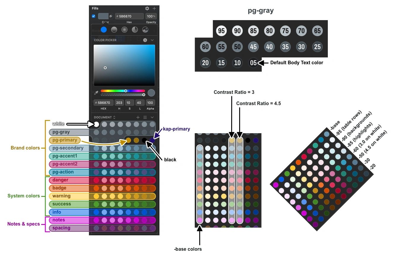
The numbers following each “color-“ name is very loosely based on the Luminance/Brightness/Lightness percentage in the colorspaces HSLuv, HSB, and HSL (rounded to increments of 5 to simplify the naming convention).
The beauty of this system is that each identically numbered color has the identical contrast ratio, regardless of hue or saturation. Additionally, the contrast ratios were carefully chosen so that any 2 colors with a difference of |40|+ will yield a contrast ratio of 3.0+, while a difference of |50|+ will always yield a ratio of 4.5+
White = 100 & Black = 00
0% Luminance in HSLuv/HSB/HSL is BLACK (#000000) which has a Contrast Ratio of 21:1 on White
100% Luminance in HSLuv/HSB/HSL is WHITE (#FFFFFF) which has a Contrast Ratio of 1:1 on White
So pg-secondary-50 (medium slate) will have a contrast ratio of 3:1 when used as the foreground on a background of pg-gray-90 (nearly white) or pg-gray-10. 50-90=|-40| & 50-10=40
The approved palette names have been named according to how they should be used, rather than a numbering scheme.

Accessible Color Ramps
Any 2 colors with a difference of |40|+ will yield a contrast ratio of 3.0+, while a difference of |50|+ will always yield a ratio of 4.5+
Copyright © 2022 Angy - All Rights Reserved.