TENMARKS
K-12 Math Educational Application
Teacher Dashboard
Before
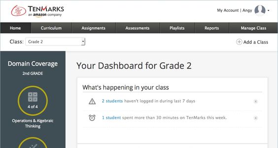
Colors and fonts were uncoordinated and had developed organically over time. Using fresh colors and fonts the designers had decided on as a team, I began redesigning the student experience. A lot of vertical space was wasted by a tall header.

After
The new page header is leaner and dropdowns are more stylized. Fresh fonts and colors help modernize the teacher dashboard.
Create a New Class
Before
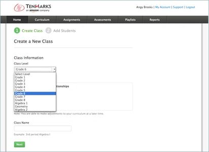
The old design is rather stark and form elements used browser defaults causing them to look dated and ordinary.
After
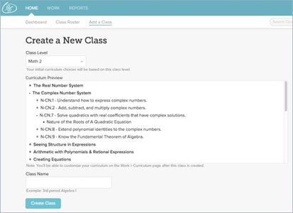
My redesign softens the background so it's not so hard on users' eyes. Updated fonts add hierarchical contrast between content, labels, and headers.
Student Experience
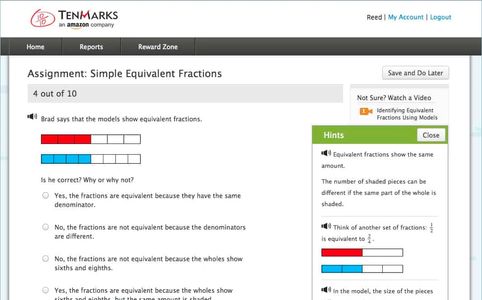
Before
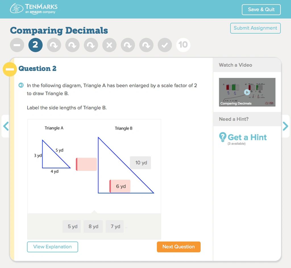
The student experience was also a rather stark and unengaging experience. Based on research the team conducted with teachers and student users, I worked closely with our visual designer to create an experience that was more engaging, provided choice, and presented the right help at the right time.
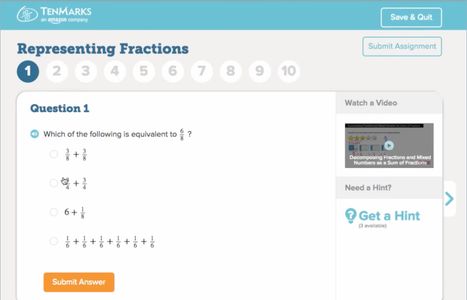
After
Students were now able to choose which questions they wanted to work on and in what order. We removed the navigation header to help students stay focused on their task and remove the opportunity to accidentally exit the application. Questions were also scored immediately and feedback given so that students would be less likely to make the same mistake on the next question. Subsequently, the Software & Information Industry Association (SIIA) honored TenMarks with a CODiE Award for 2015, for Best Mathematics Instructional Solution.
Copyright © 2022 Angy - All Rights Reserved.